A well-designed and strictly written page about web design practices
Web development
DokuWiki and Syntax
I have tried Dokuwiki for a personal wiki. It’s ugly. It forces me to edit pages as a plain text files, using it’s own wiki syntax format. It also stores articles in a format of wiki text. Every time somebody wants to view a page, Dokuwiki parses wiki-formatted file and produces HTML. Every time. That’s how article looks in a wiki format.
====== HiPath 4000 Backup destinations: ======
  - MO/CF
  - Server
    - NFS
    - FTP

====== HiPath 4000 HDD Layout ======

^Name	^Purpose	^Contents^
|:PDS:	|program disk	|RMX|
|:DBD:	|Debug disk	||
|:AMD:	|Administration and maintenance disk	||
|:CGD:	|Call change disk	|tarification files|
|:TMD:	|Traffic metering disk	||
|:PAS: 	|Miscellaneous usage	|REGEN file|
Looks ugly. That is a how your data is seen by both editor and application. Both editor and dokuwiki have to be able to understand wiki syntax in order to see the formatted data. Both are negatively affected. Editor has to learn a new syntax for writing an article, Dokuwiki has to translate article to HTML every time user requests it (many times).
The third victim is data itself. It gets transformed to an ugly format, compatible with the only software which is wiki engine you use. In other words, if you let a wiki engine take care about your information, the information would most likely stay in there forever. If you want to extract a document from a wiki engine, you have to render a page, using the engine.
Why do we need to have wiki-formatted intermediate presentation? The official answer is to help users who lacks HTML+CSS knowledge to develop a document structure. It probably worked in 2000, when there was no technology for creating interactive applications in a browser. Nowadays things changed. We have Google docs, which allows a document to be edited in WYSIWYG mode, and, moreover, to be stored and exported in any format. Some might say WYSIWYG editors corrupt formatting when used in a wrong way. It applies to documents where we need a style. In a Wiki we do not aim to create a document with style. We do aim to develop a document with structure. Style has to be generated by a wiki engine.
Hence, the best approach for wiki architecture is: editing documents in WYSIWYG, storing documents in a structured format without styles, presenting them as-is.
It is very important not to let WYSIWYG editor to define styles. It’s a common user mistake to apply styles to an articles. Styles has to applied by an application. An editor should define the structure of the document only: Headings, paragraphs, tables, code, bold, italic, etc. Editor needs no colours, no browser compatibility nothing extra.
Let the approaches be compared:
| Stage | Wiki-approach | Correct approach | Best approach |
| Editing | Using ugly wiki format, which is neither a document, nor a pure data |
Using WYSIWYG editor, which allows editing structure, but not styles. |
Using WYSIWYG editor, which allows editing structure, but not styles. |
| Storing | Using ugly wiki format, which is neither a document, nor a pure data |
Using a structured document format, like (X)HTML, XML, OD> |
(X)HTML with no styles |
| Presenting | Parsing wiki format, restructuring it to a document (HTML+CSS) |
Presenting a stored document as is+ applying some predefined styles to it. |
(X)HTML + CSS style |
| Engines | MediaWiki, DocuWiki, pmWiki | Almost there: WordPress, MoinMoin, Sharepoint wiki module… | ??? |
Currently there is no Wiki engine in the market who does the job right.
3 Things Web Can Not Do in 2011
There is no way to share files between end-users without a server. You have to share a file somewhere on a server. Even torrents require a tracker. I want to have an opportunity to let someone download a file I have. in a current situation I have to either share it somewhere, either email it, or my PC a server. Every way is too complicated.
There is no standard on RSS feed entries formatting and rendering. It’s somehow HTML and CSS, but since there are many kinds of feed aggregators, they all render HTML-in-XML differently. Also, there is no way to apply proper JS to RSS entry, because there is no proper DOM support and no specification for a RSS reader opportunities as well as rendering rules.
There is no way to download several files by a single click. You have to either click every file’s URL, either download a single archive with multiple files inside. URL does not support including several files in a single hyperlink. This architecture lays in an architecture of a very first designs of web.
If you know any desired feature, web does not yet support, feel free to share your thoughts.
T1 logo in JS+PNG
Initially, my logo was 105K GIF. Now it’s transparent PNG+JS. As easy as:
            //
            var color = 0;
            var interval = 60;  /* time msec, after which color changes */
            var clrInc = 4;     /* HSV degree increment */
            function chcolor(){
                var t1_logo = document.getElementById("t1_tl"); /* div_to_animate */
                color < 360 ? color = color + clrInc : color = 0;
                t1_logo.style.backgroundColor = "hsl("+color+", 100%, 50%)";
            }

            function stchcol(){
                var logoChCol = setInterval(chcolor, interval);
            }
            window.onload = stchcol;
            //-->
and
Benefits are smaller page size, smaller prcessor load. Eventuall, animation in JS consumes lees resources than a GIF rendering. 35% losad with GIF animation vs 15% load with JS animation. At least, in Fedora 16 with nouveau.
The idea was given to me by fiskus, but it was quite a long ago, so I feel I had the same idea at the moment he suggested it to me. Nevertheless, he desrves a credit.
T1 logo creation
 Artists draw their sketches, painters draw their pictures, modelers render their 3D, hackers program everything. I have coded my logo. I know the result is neither beautiful nor creative if you compare it to professional designer’s job. But it’s not stolen, it’s hand made and it is mine.
The decision to code the logo came after observing my drawing skills. No drawing skills were discovered. Despite, desire to create my own logo remained. I have chosen Processing for the task, I have had planned to try the Processing for a while already.
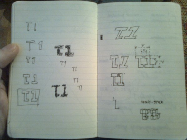
Designing the logo did not take much time. A bit of symmetry, a full rainbow of colors, “t1” in text. “T1” is acronym for tiamat, which is my nickname proudly.
How it worked? I have coded the logo’s appearance. After I’ve added processing built-in frame-to-image exporter and ran algorithm in a way, that all colors would fill the logo. I have used HSV for the logo’s color so I got 360 frames on output. All of them were imported to GIMP and combined to a single GIF image. I do not remember the formula of combining frames into GIF but it was a simple task.
There is a java applet with a showcase of the logo, there is code (1, 2) of the java applet, there is a GIF image. Yes, the code is terrible, ugly, slow. As any other “hello world” program. I am proud of it no matter what.
New design for the site blog
Most of my readers have already seen a new design of my web log. Despite I want to tell a bit about it just to log the event.
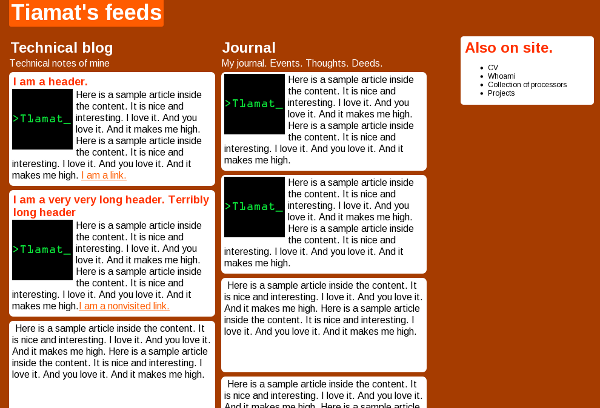
There were three stages. At first stage there was do design plan, only desire to create something unusual. I came up with that:

Nobody liked it. In the end I didn’t like it as well. Page had to br redesigned. Going through second iteration it was decided to start with a plan and proceed to design with a second step.
The goals of output were:
– Geeky design
– Typographic design
– Black, Grey tones and white colors.
– Easily readable articles.
– Easy navigation .
– Easy site navigation
– Text should attract more attention than pictures.
– large pictures have to be supported.
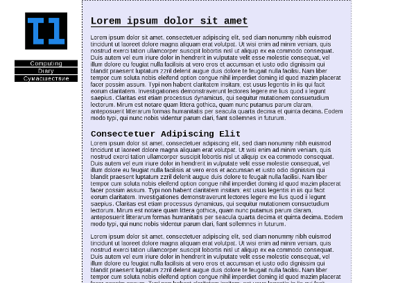
Trying to fulfill the goals, I wrote whole design document describing the design. I won’t publish it yet, because it’s classified. After all design have been described, the second iteration have begun. I made HTML draft fulfilling the design goals according my doc and made WP theme. The result looked the following way:

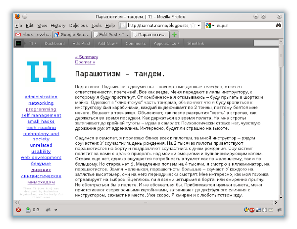
At third, I made a revision and came to conclusion design was heavy. Playing with color, I made it lighter. I got that:


