Most of my readers have already seen a new design of my web log. Despite I want to tell a bit about it just to log the event.
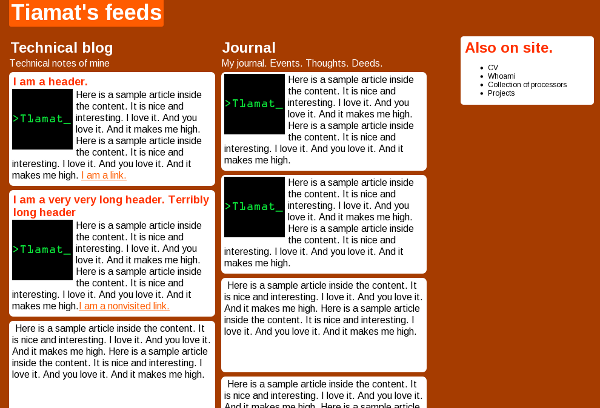
There were three stages. At first stage there was do design plan, only desire to create something unusual. I came up with that:

Nobody liked it. In the end I didn’t like it as well. Page had to br redesigned. Going through second iteration it was decided to start with a plan and proceed to design with a second step.
The goals of output were:
– Geeky design
– Typographic design
– Black, Grey tones and white colors.
– Easily readable articles.
– Easy navigation .
– Easy site navigation
– Text should attract more attention than pictures.
– large pictures have to be supported.
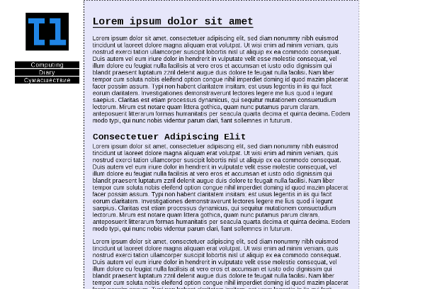
Trying to fulfill the goals, I wrote whole design document describing the design. I won’t publish it yet, because it’s classified. After all design have been described, the second iteration have begun. I made HTML draft fulfilling the design goals according my doc and made WP theme. The result looked the following way:

At third, I made a revision and came to conclusion design was heavy. Playing with color, I made it lighter. I got that:

