Блог лежал с 3 по 17 октября, потому что 3 отктября у меня истек домен и я пропустил нотификацию от регистратора. О проблеме я узнал 13го и ошибочно идентифицировал ее, как неполадки с веб-сервером, о чем написал в поддержку хостеру. Хотсер ответил в тот же день, что ДНС-запись адрес смотрит не на их IP. Затем я 4 дня был поглщен делами и не занимался траблшутингом, пока наконец не решил проверить, куда же смотрит моя днс-запись. Оказывается, домен истек.
Выводы
- Мониторить доступность блога. Стендалон – это ответственность.
- Добавить в календарь напоминалки на даты обновления сервисов.
- Делать бекапы
Сапожник, как всегда без сапог. На работе во весь рост внедряешь процессы, итил, сервис менеджмент, а собственный блог лежит две недели. Это делает очевидным то, что мне на него уже давно положить. И снова посещает мысль, что надо больше писать.
Hello dear RSS readers and others who never saw my front page. It’s time for prayer. Dark lord Tiamat changed his homepage design to… white colors! New design is approved by muslim, orthodox, mormon and satanic churches, is holy, is awesome, finds water, contains positive energy flows, brings luck to every visitor (share links). Dear readers, do you like it?
I am cross posting to my abandoned lj since the previous post. If you have a livejournal account, feel free to add me as a friend.
Ever since I left to standalone I have lost all the commentators. Eventually, standalone blogging does not seem to attract neither readers nor commentators. I hope a dead body of my blogging can be resurrected to a nice attractive zombie.
 Artists draw their sketches, painters draw their pictures, modelers render their 3D, hackers program everything. I have coded my logo. I know the result is neither beautiful nor creative if you compare it to professional designer’s job. But it’s not stolen, it’s hand made and it is mine.
The decision to code the logo came after observing my drawing skills. No drawing skills were discovered. Despite, desire to create my own logo remained. I have chosen Processing for the task, I have had planned to try the Processing for a while already.
Designing the logo did not take much time. A bit of symmetry, a full rainbow of colors, “t1” in text. “T1” is acronym for tiamat, which is my nickname proudly.

How it worked? I have coded the logo’s appearance. After I’ve added processing built-in frame-to-image exporter and ran algorithm in a way, that all colors would fill the logo. I have used HSV for the logo’s color so I got 360 frames on output. All of them were imported to GIMP and combined to a single GIF image. I do not remember the formula of combining frames into GIF but it was a simple task.
There is a java applet with a showcase of the logo, there is code (1, 2) of the java applet, there is a GIF image. Yes, the code is terrible, ugly, slow. As any other “hello world” program. I am proud of it no matter what.
Most of my readers have already seen a new design of my web log. Despite I want to tell a bit about it just to log the event.
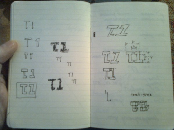
There were three stages. At first stage there was do design plan, only desire to create something unusual. I came up with that:

Nobody liked it. In the end I didn’t like it as well. Page had to br redesigned. Going through second iteration it was decided to start with a plan and proceed to design with a second step.
The goals of output were:
– Geeky design
– Typographic design
– Black, Grey tones and white colors.
– Easily readable articles.
– Easy navigation .
– Easy site navigation
– Text should attract more attention than pictures.
– large pictures have to be supported.
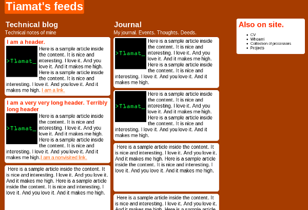
Trying to fulfill the goals, I wrote whole design document describing the design. I won’t publish it yet, because it’s classified. After all design have been described, the second iteration have begun. I made HTML draft fulfilling the design goals according my doc and made WP theme. The result looked the following way:

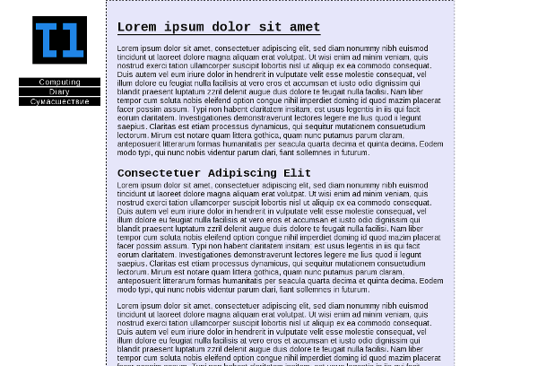
At third, I made a revision and came to conclusion design was heavy. Playing with color, I made it lighter. I got that:

Real life experience have indicated that maintaining 2 blogs on separate domains with separate blog engines is useless time wasting. Maintaining took more time that actual content production, despite it was planned opposite. I had planned to create highly distributed web site which is easy to maintain. But I ended up fighting with WordPress updates and administrative obligations. So my “highly distributed easy maintainable site” got a slave, wasting time maintaining the site. Fed up, I killed my master, took his content and mixed it in united blog.
Bilingualism
Since now this site will be updated in two languages – English and Russian. All computer-related thematic will be in English since now. All diary-like, linguistic and discourse records will be in Russian. For those who is interested in some specific posts (anybody?) , there is opportunity to subscribe to any category individually. But I kindly advise everyone to subscribe to full feed. English-learning is included for free.
Design
I will no longer use standard templates. I have almost accomplished last version of my personal design. Soon i’ll move it to WP template and everyone will be happy. Specially, me.
New design will be simple end geeky-like.
RSS
All RSS will go through feedburner. DO NOT SUBSCRIBE TO MY BLOG YET. I didn’t pass feeds through Feedburner yet. List of feeds will be announced later.
Privacy.
No any attempt to anonymize myself. My name is Evzhenkov Svyatoslav and I am in charge of every piece of content published here. Haters (anybody?) might suck my dick.
Writing.
Again, I’ll try to write as much as possible. Currently, most topics I want to write about are discarded due to lack of time. I promise not to do that.
Usability.
OpenID, and other useful stuff is already coming. Implementation will be announced shortly.


 Artists draw their sketches, painters draw their pictures, modelers render their 3D, hackers program everything. I have coded my logo. I know the result is neither beautiful nor creative if you compare it to professional designer’s job. But it’s not stolen, it’s hand made and it is mine.