Tiamat.name has a favicon now. Happy Firefox users see ![]() . Opera, Konqueror, Chrome users see only the first frame from the gif:
. Opera, Konqueror, Chrome users see only the first frame from the gif: ![]() . IE users should see
. IE users should see
There is no way to share files between end-users without a server. You have to share a file somewhere on a server. Even torrents require a tracker. I want to have an opportunity to let someone download a file I have. in a current situation I have to either share it somewhere, either email it, or my PC a server. Every way is too complicated.
There is no standard on RSS feed entries formatting and rendering. It’s somehow HTML and CSS, but since there are many kinds of feed aggregators, they all render HTML-in-XML differently. Also, there is no way to apply proper JS to RSS entry, because there is no proper DOM support and no specification for a RSS reader opportunities as well as rendering rules.
There is no way to download several files by a single click. You have to either click every file’s URL, either download a single archive with multiple files inside. URL does not support including several files in a single hyperlink. This architecture lays in an architecture of a very first designs of web.
If you know any desired feature, web does not yet support, feel free to share your thoughts.
Initially, my logo was 105K GIF. Now it’s transparent PNG+JS. As easy as:
            //
            var color = 0;
            var interval = 60;  /* time msec, after which color changes */
            var clrInc = 4;     /* HSV degree increment */
            function chcolor(){
                var t1_logo = document.getElementById("t1_tl"); /* div_to_animate */
                color < 360 ? color = color + clrInc : color = 0;
                t1_logo.style.backgroundColor = "hsl("+color+", 100%, 50%)";
            }

            function stchcol(){
                var logoChCol = setInterval(chcolor, interval);
            }
            window.onload = stchcol;
            //-->
and
Benefits are smaller page size, smaller prcessor load. Eventuall, animation in JS consumes lees resources than a GIF rendering. 35% losad with GIF animation vs 15% load with JS animation. At least, in Fedora 16 with nouveau.
The idea was given to me by fiskus, but it was quite a long ago, so I feel I had the same idea at the moment he suggested it to me. Nevertheless, he desrves a credit.
I discovered another piece of computer’s history related to Microsoft’s standards ignorance. Eventually, in the early days of WEB, there was ASCII which supported only American english characters. It was fine for American-speaking users, but obviously not fine for the rest of the word who wanted to use other symbols. To solve it, ISO 8859 family of encodings was standardized. These encodings were using 8th bit of ASCII (occupying 7 bits) and were an addition to ASCII, hence, they were backwards compatible with ASCII.
The ISO 8859-1, or “Latin 1” was the most widely used encoding. it was used as a default charset for Linux, for an early HTML versions, for X server etc. Since it was used in HTML, it was used by a Microsoft software too. Not surprisingly, Microsoft had it’s own unique vision of standards.
Microsoft delivered their own Latin-1 – Windows 1252 with their own set of characters in a range from 0x82 through 0x95. The mentioned range is not used in ISO Latin-1. What characters were in the proprietary range? There were quotes, apostrophes and some more.
If you were creating HTML in a Microsoft software, and it had “smart quotes” option enabled (it’s enabled by default), the resulting HTML document would be in Windows-1252. Hence, it would contain quotes and apostrophes from the ISO-unused range. As a result, when windows-1252 file is opened in a browser in non-windows OS, the invalid characters are ignored or replaced by either question marks or a white space, making the page ugly.
Surprisingly, There are still quoteless and apostropheless web pages out there in the Internet. If own one of them, please apply demoronizer to it.
Resources:
Most of my readers have already seen a new design of my web log. Despite I want to tell a bit about it just to log the event.
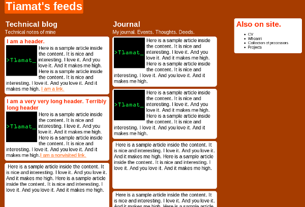
There were three stages. At first stage there was do design plan, only desire to create something unusual. I came up with that:

Nobody liked it. In the end I didn’t like it as well. Page had to br redesigned. Going through second iteration it was decided to start with a plan and proceed to design with a second step.
The goals of output were:
– Geeky design
– Typographic design
– Black, Grey tones and white colors.
– Easily readable articles.
– Easy navigation .
– Easy site navigation
– Text should attract more attention than pictures.
– large pictures have to be supported.
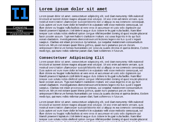
Trying to fulfill the goals, I wrote whole design document describing the design. I won’t publish it yet, because it’s classified. After all design have been described, the second iteration have begun. I made HTML draft fulfilling the design goals according my doc and made WP theme. The result looked the following way:

At third, I made a revision and came to conclusion design was heavy. Playing with color, I made it lighter. I got that:
