 Artists draw their sketches, painters draw their pictures, modelers render their 3D, hackers program everything. I have coded my logo. I know the result is neither beautiful nor creative if you compare it to professional designer’s job. But it’s not stolen, it’s hand made and it is mine.
The decision to code the logo came after observing my drawing skills. No drawing skills were discovered. Despite, desire to create my own logo remained. I have chosen Processing for the task, I have had planned to try the Processing for a while already.
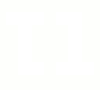
Designing the logo did not take much time. A bit of symmetry, a full rainbow of colors, “t1” in text. “T1” is acronym for tiamat, which is my nickname proudly.

How it worked? I have coded the logo’s appearance. After I’ve added processing built-in frame-to-image exporter and ran algorithm in a way, that all colors would fill the logo. I have used HSV for the logo’s color so I got 360 frames on output. All of them were imported to GIMP and combined to a single GIF image. I do not remember the formula of combining frames into GIF but it was a simple task.
There is a java applet with a showcase of the logo, there is code (1, 2) of the java applet, there is a GIF image. Yes, the code is terrible, ugly, slow. As any other “hello world” program. I am proud of it no matter what.
Most of my readers have already seen a new design of my web log. Despite I want to tell a bit about it just to log the event.
There were three stages. At first stage there was do design plan, only desire to create something unusual. I came up with that:

Nobody liked it. In the end I didn’t like it as well. Page had to br redesigned. Going through second iteration it was decided to start with a plan and proceed to design with a second step.
The goals of output were:
– Geeky design
– Typographic design
– Black, Grey tones and white colors.
– Easily readable articles.
– Easy navigation .
– Easy site navigation
– Text should attract more attention than pictures.
– large pictures have to be supported.
Trying to fulfill the goals, I wrote whole design document describing the design. I won’t publish it yet, because it’s classified. After all design have been described, the second iteration have begun. I made HTML draft fulfilling the design goals according my doc and made WP theme. The result looked the following way:

At third, I made a revision and came to conclusion design was heavy. Playing with color, I made it lighter. I got that:

There are people who follows mainstream and like it. There are ones, who follows mainstream and dislikes it. There is somebody trying to change mainstream. That guy came up with a brilliant idea. I was really impressed by simplicity of the idea. Really, why nobody developed mobile with design like that?

Author, source.